We listen. We think. Then, we speak.

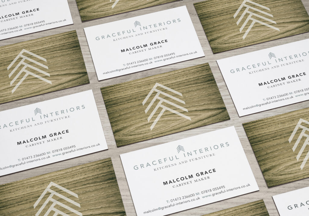
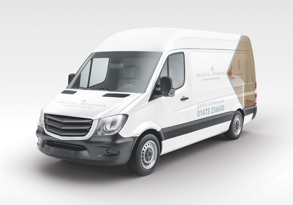
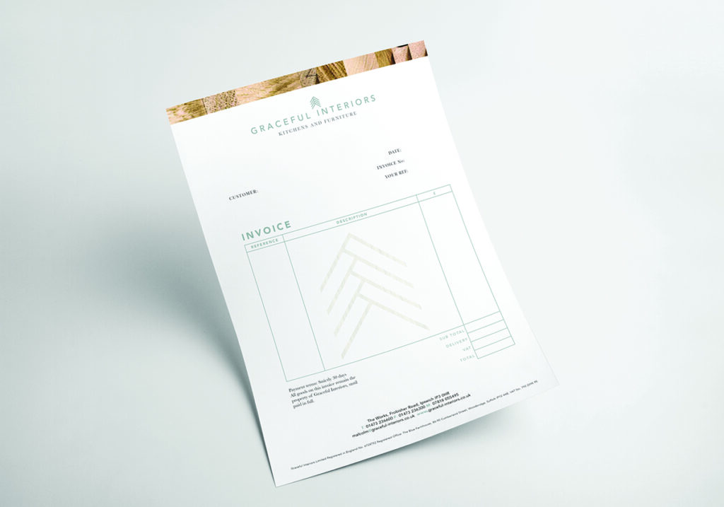
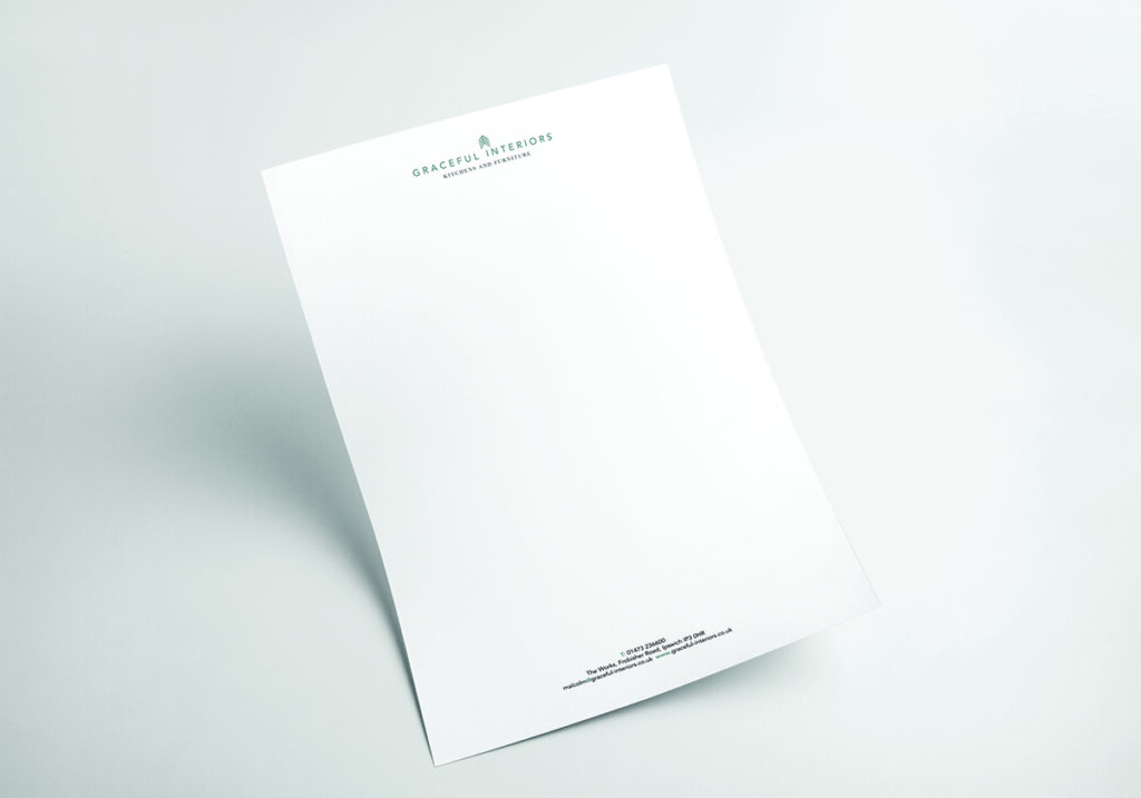
This identity communicates the notion of craftsmanship in a contemporary setting. The logo represents an abstracted sense of joinery and avoids the visual clichés of wood. We purposely chose a colour palette of steel blues and greys to give the logo a cool and modern feel. The mark is making a visual reference to the detail of a dovetail joint found in carpentry.
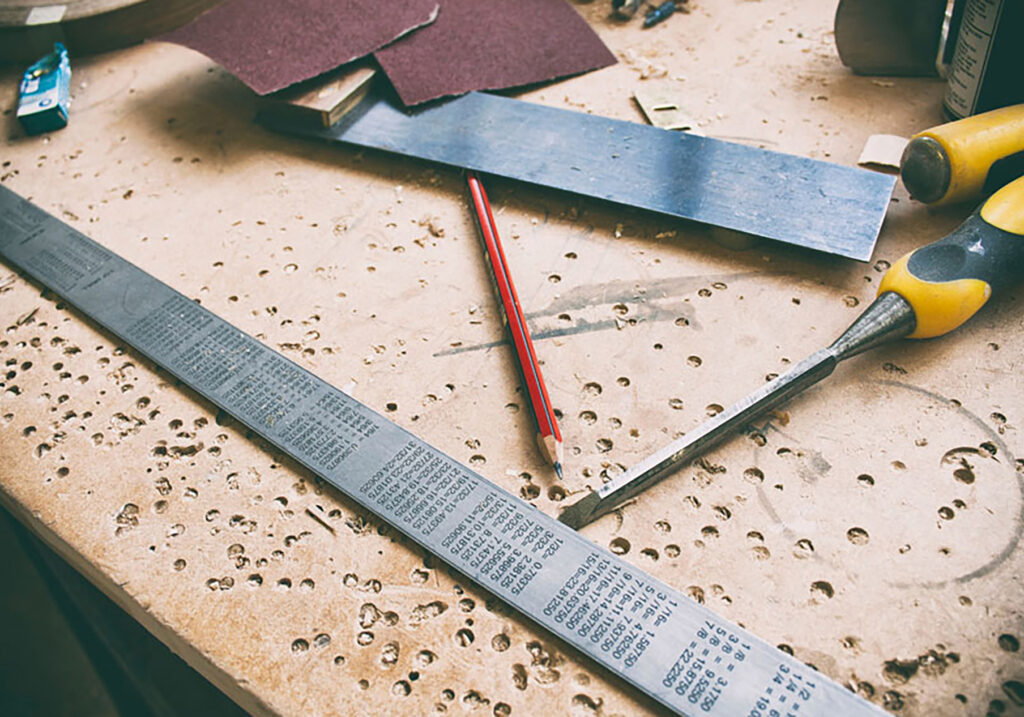
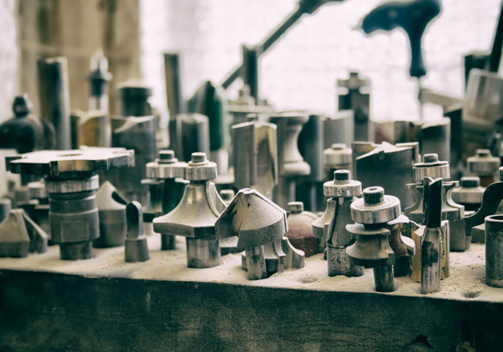
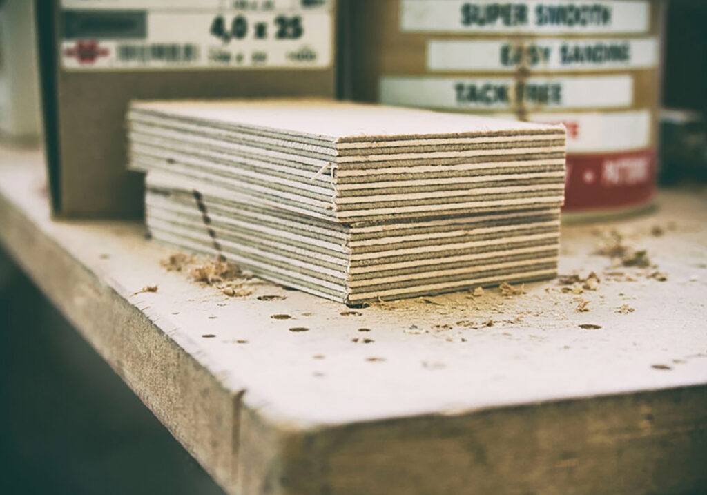
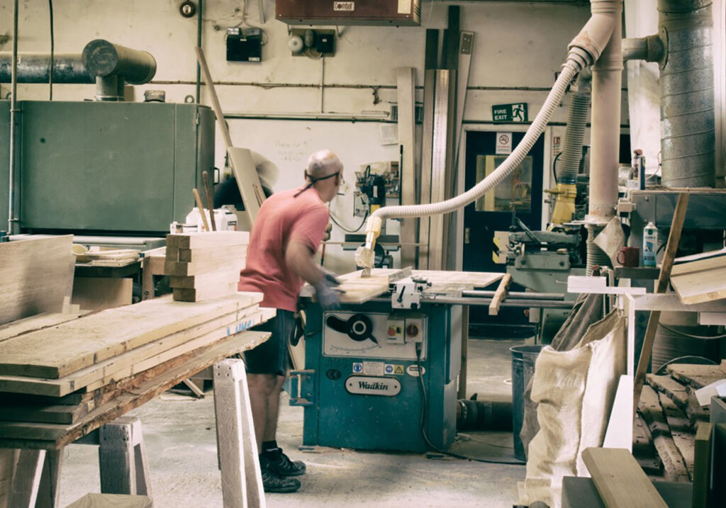
The tone of voice uses language associated with craft, which places the notion of tradition in a contemporary setting. The core values of craft were further extended by a contemporary use of wood textures, which can be seen in our art direction of the photography.
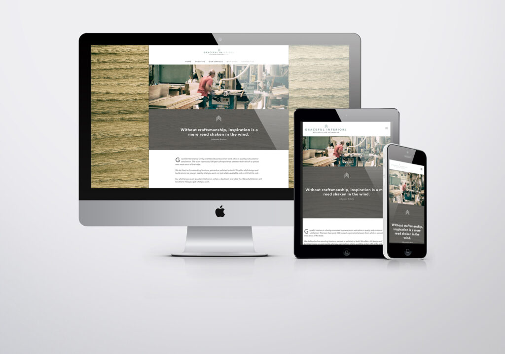
The website is a fully responsive, which means that it works across all devices. This ensures that the user experience is as positive as possible and we established and support the social media profiles.